I'm in the throes of redecorating my family room. It's minor. I just want to update the pillows and accessories and I'm all over Pinterest and every design blog under the sun looking for inspiration.
Most of the furniture has to stay and I'm not updating the kitchen or eating area—which are all part of the same space—so I'm pouring over inspiration boards looking for, well, inspiration.
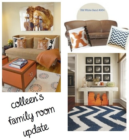
Many of my decor accents are warm-toned with lots of ochre and burnt orange (more commonly referred to as "trapped in 1999"). I'm looking for the perfect colour to shake things up and my wonderful interior designer friend, Laura Thornton of Thornton Designs, said the magic word: NAVY!
I adore navy. It's classic but yet somehow seems fresh in a sea of grey (the decorating colour of the 2010s it seems). I've been eating, sleeping and breathing the combination of the two: orange and navy.
I spend my Saturday mornings doing a quick grocery shop while my daughter's at ballet class (read: my Saturday mornings suck) so imagine my surpise when I came along this sharp little number:

In high-fashion terms, the combination is a little 2010 but in my reality, it's a $24 long-sleeve tee that looks mighty sharp:

Just like the model, right?
Oh, and, note to self: my nude layering tank is too long and looks like a Bella Band.
In the end, that pretty little shirt made it into my cart amongst the makings of Chili and Jerk-Chicken Nachos and I may even watch the Super Bowl while wearing it. Too bad the Chicago Bears aren't playing!